6 A/B Tests You Can Run on Your E-Commerce Cart
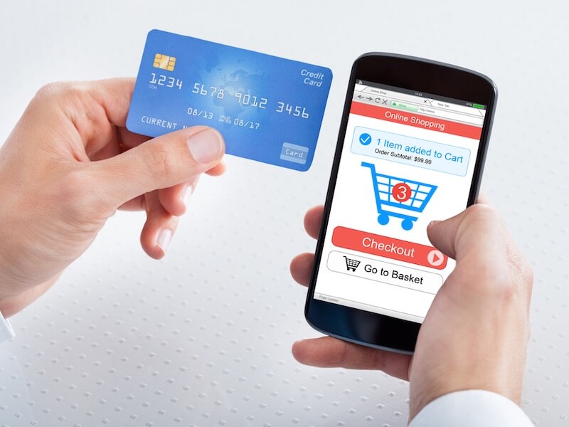
Any successful e-commerce business aims to increase conversions. A/B testing — also called split testing — can aid in achieving that goal. A/B testing involves showing two different versions of something to different groups to see which one performs better.
A/B testing offers numerous advantages. For example, it helps you reduce the likelihood of spending a substantial amount of money to revamp a portion of your site only to discover the change didn’t bring the anticipated results. You can run an A/B test first to get a clear idea of the effects of a tweak.
An A/B test also allows you to test a single characteristic at a time by evenly splitting the traffic between each version and comparing the outcomes. Thus, this method of testing keeps you focused rather than trying to make too many changes at once, and finding it impossible to verify which one caused the most benefits.
Analyzing the data generated from A/B tests is quick and straightforward, too. You can often do it in real-time while collecting the information.
If you perform A/B tests on an e-commerce cart, that approach should give you valuable insights for improving conversions. What makes people increase the sizes of their purchase? Which shopping cart elements raise a person’s confidence in site security? Can you make a new user more likely to register for an account instead of leaving without purchasing? A/B testing can answer those questions and more.
Here are six A/B tests you should consider running for e-commerce cart optimization purposes:
1. Simplify the Selection Process for Optional Goods/Services
Perhaps your company offers suggested items based on the things in a person’s cart. If so, you might hypothesize that more people would complete their checkouts if you simplified the process for choosing those extras or allowing a person to confirm they didn’t want them. If you need to prioritize your hypothesis after coming up with several options, consider how drop-down lists and pop-up windows could aid in picking optional extras.
A company that specializes in helping customers book travel packages performed an A/B test that changed the steps individuals took to add optional services. The control option had three large buttons at the bottom of the page. Then, the revamped version included small plus sign (+) buttons that people could press to indicate their desire to tack on extra stuff to their purchases — then a large green Checkout button.
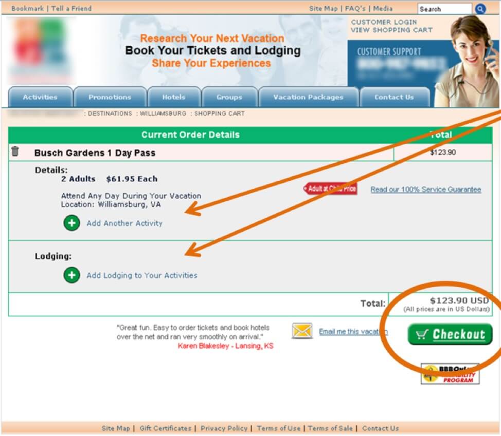
The changed versioncaused a 36.5% increase in cart conversions. It also made the process of paying for something less cumbersome. If customers get confused or upset about the checkout process, they may give up, causing the associated companies to miss out on near-sales.
2. Make “Cart Carrots” More Visible
Besides getting customers to buy things, marketers also want them to buy more in each transaction. They could achieve that with strategic A/B testing related to “cart carrots.” Those are prompts that urge people to add more items to their carts to qualify for a special offer or discount.
You may hypothesize that your cart carrots get missed in the overall layout of your shopping cart, meaning that people don’t see them. If trying to prioritize a hypothesis, figure out which options are most likely to increase visibility and sales, and choose one of those selections. You can always go back and try the others in future tests.
The beauty retailer Ulta puts its cart carrots in red text and displays them directly above a person’s total on the shopping cart page. Some other companies place their cart carrots elsewhere, such as in banners in the uppermost section of a page. However, it’s easy to see why putting them near a person’s total price to pay is a smart idea.
Most people arguably look at the total amount before consenting to it. They might want to ensure their monthly budget is big enough to accommodate the purchase. Or, they might consider whether the amount is small enough that they can add a few more things before moving further along in the process. When building a test, you should only change one aspect of the cart carrot in each one, whether that means the color, position or something else.
3. Add a Security Badge to the Shopping Cart Page
Since data breaches have become so common, many customers want extra assurance that e-commerce retailers are doing what they should to maintain a stable cybersecurity infrastructure. Your company may hypothesize that people will buy more frequently if you add a security badge to the checkout page. That possibility is not far-fetched.
For example, the owner of a website called RTA Cabinet Store decided to test the effects of placing a Norton Secured Seal to the right side of his shopping cart, directly underneath the list of all the items a customer purchased and the respective prices. He reported that the minor change caused a 23.9% boost in cart completion rate, plus an 18% uptick in revenue.
If you are trying to prioritize hypotheses related to several kinds of security badges or their placement on your website, focus on name recognition and prominence. For example, the provider of the security badge should be a brand that most people know, and you should strongly consider putting the graphic in an easy-to-see location on the shopping cart page — such as not in the footer.
4. Implement Social Sharing Buttons to Drive Shopping Cart Conversions
Imagine a scenario where a person begins shopping at your e-commerce website and fills a cart with things they want to buy. They likely can’t progress past that point without registering or logging in first. Even when a company offers a guest checkout option, most shoppers typically must provide at least an email address so that the system has some well-defined way to identify them.
Statistics indicate that nearly 80% of people prefer to use social sharing buttons instead of creating new registrations. Maybe you hypothesized that registration forms are the top reason why shoppers don’t purchase their items after putting them in their shopping cart. In that case, you could put the social sharing buttons directly on the shopping cart page and call them out as options that let shoppers finalize their transactions faster.
Fashion retailer ASOS engaged in A/B testing that involved social sharing buttons for facilitating site registration. The retailer added a prompt on the shopping cart page that asked, “New to ASOS?” and paired it with a Continue button. When people clicked the button, they saw a screen that displayed the social sharing buttons for new users, plus allowed registered users to log into their accounts. That change cut the cart abandonment rate in half.
You can also consider embedding social sharing buttons into the final step of your checkout process. If buyers use them, they could show their friends a breakdown of what they just bought, which may encourage those people to make similar purchases at the same retailer. Ticketmaster does that by displaying social media sharing links on the order confirmation pages that consumers see after buying tickets.
You may come up with several hypotheses that relate to social media sharing buttons and your shopping cart. If so, that’s okay. Explore your existing customer data to get a better idea of which usage possibilities are best for you. For example, if cart abandonment is a significant problem, and you know it most often happens when individuals try to pay for the items in their shopping carts, using social media sharing buttons to streamline registration is a wise move.
5. Display Information or Resources Within the Shopping Cart Page to Inform Customers
If customers have items in their shopping carts, but unanswered questions remain, they may decide it’s not worth the risk to complete their purchases. Gap, the clothing retailer, addressed that matter by adding links to the shopping cart page that customers could use to get details about shipping, returns and the company’s credit card safeguards.
However, there may be cases when even the most carefully formulated hypotheses fail to materialize in the A/B test results. A Dutch e-commerce retailer called fonQ found that out when a tweak to the checkout flow required shoppers to scroll down and look at delivery and shipping details within the shopping cart page before proceeding. The results of that A/B test were not statistically significant, though.
Despite that particular outcome, the team devising the A/B tests was not deterred. They ended up building other tests that caused significant revenue increases. The lesson learned here is that even if A/B tests don’t deliver the expected information about customer behavior and conversions, you should not give up. Go back to the drawing board and either choose other tests to develop based on an existing list of hypotheses, or create entirely new ones.
6. Create a Dedicated Cart Page for Mobile Users
With mobile traffic rates rising considerably, people are increasingly likely to buy things online using a smartphone rather than a computer. You may create a hypothesis that says the current cart page — shown to all shoppers — frustrates mobile users.
Smith Optics, an online eyewear retailer, wanted to increase its conversion rates. It hired surefoot.me to take a close look at the best ways to do that. The findings showed a significant reduction in mobile traffic on the cart page. Moreover, user tests with Convert Experiences showed that mobile users scrolled up and down within the shopping cart screen, unaware of the next steps. Once the company made a specific page to help mobile users, there was an 8% lift in checkout visits at 95% statistical significance and a 3.4% increase in transactions.
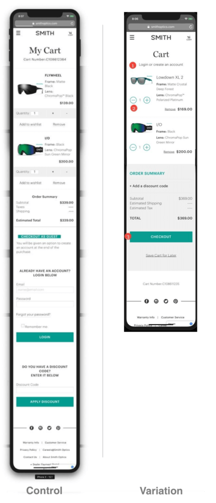
Before creating a separate cart page for mobile users, though, consider running several A/B tests concerning one mobile-friendly aspect each. Then, include the top-performing characteristics on the page.
Looking for a tool to build new A/B tests? Check out Convert Experiences, it’s free to try for 15 days!
Exciting Suggestions for More Productive A/B Tests
These six ideas are not the only A/B tests you can implement for your e-commerce cart. However, they could facilitate your processes and highlight the payoffs of doing this kind of e-commerce cart optimization effectively.