5 Conversion Centered Design Site Elements & How They Support CRO

Conversion-Centered Design (CCD) aims to convert site visitors to customers by focusing on user experience (UX).
The connection between CRO and UX was not always clearly established. It was previously thought that CRO and UX were competing goals that could not be reconciled. This idea no longer applies because conversion-optimized web design incorporates a focus on user experience.
In this blog post, we are going to talk about 5 Conversion Centered Design elements that when added to the site expedite the future process of conversion rate optimization by offering a solid foundation to work from.
Conversion-Centered Design (CCD) & its Impact on Websites
Let’s back up a few paces and talk about Conversion-Centered Design. If you are already very well versed with the term, then probably this blog isn’t for you.
However, if you are testing the waters with CRO and don’t really have much of an in-house design team, then this is the resource that you can walk away with some AHA moments from.
In short Conversion Centered Design is design that takes into account the principles of Attention, Context, Clarity, Congruence, Credibility, Closing and Continuance, so that visitors and browsers can easily find a path of least resistance to the macro/micro goal of the site or the landing page.
Design that’s developed keeping these aspects in mind is less like a jungle of possibilities and more like a streamlined way to get from point A (entry) to point B (conversion). It supports the goal of Conversion Rate Optimization by eliminating needless confusion from probable hypotheses and it offers better conversion rates out of the gate in most cases. That’s the whole point of the exercise.
Conversion-centered design is most effective when it takes into account all aspects of the visitor’s journey. There are specific patterns and navigational flows that are followed during a customer’s journey on a website or app over their life cycle.
Perhaps top of the funnel leads visit blogs more often, whereas middle of the funnel leads frequent free trial and pricing pages. Once these flows are established (identified), it is a matter of almost mathematical precision to apply the 7 principles of CCD to all elements in those flows.

Conversion-centered design fully takes the UI/UX of patrons into account. A page that is slow to load or lags to process request deters a conversion before it even has a chance to begin. A visually stimulating page is equally as important to the page’s speed performance.
Here are 5 tried and tested Conversion Centered Design site elements, plus the impact they have on conversion rate optimization.
Site Menu
The site menu is a crucial element of a website for new visitors and frequent customers. Creating a site menu that is clear and easy to access makes site navigation quicker. Navigation menus that use larger fonts are generally easier for visitors to read and understand on any device.
Create relative categories for visitors to filter and sort the site’s content.
Usage of drop-downs and site menus provide access to additional information on sub-categories. Use all precautions to prevent a site menu from appearing too cluttered.
A quick scan is all the commitment that a guest allots the time for. The objective here is to load their desired content as quickly as possible. Do NOT bombard them with every detail at this stage. Less is more. Encourage them to explore further without presenting a never-ending list of sub-categories at once. Include an intuitive search bar and filter option.
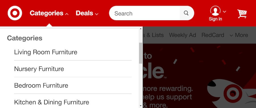
Target.com has 6 available navigation options on their mobile site menu: home icon, categories, deals, search bar, sign-in, and shopping cart.
Take-Away: Remember web site navigation is a formula. Choose which areas of the site that should be explored first and what options should be presented next to guide them along the conversion process effortlessly. This removes analysis paralysis and makes the selection of a next action that much more likely.
Call to Action Button
The implementation of a call to action is one of the most critical aspects of web design to drive conversions.
While most businesses no longer deliberate over the color of CTA buttons, or the cryptic (aggressive) text of “SUBMIT” … there is more to the art of call-to-action buttons than meets the eye.
Here are a few key pointers:
- CTA buttons are transitional in nature…they take leads from one part or stage of the buyer’s journey to another.
- They showcase the need to commit to your brand – irrespective of the size of the ask you are making.
- They can influence the sentiment of the buyer in the split second it takes to make a decision to move forward or bounce off. For example, lack of clarity around what will happen when a CTA button is clicked is one of the biggest reasons why actions are left incomplete – like abandoned shopping carts. The CTA button thus should be a mini value proposition all on its own. It has to cajole browsers into taking action, while being clear at the same time.
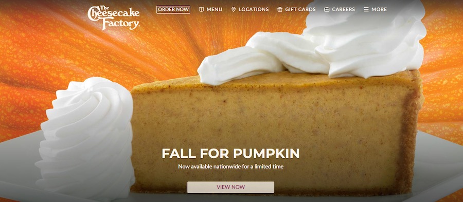
The Cheescake Factory’s “VIEW NOW” call to action button promises visually delightful images of pumpkin desserts (who doesn’t like those!) and also leaves no doubt in the person’s mind as to what will come next.
Take-Away: Applying the principles of CCD discussed in this section turns CTA buttons into convenient stepping stones allowing people to make their way down the funnel.
If they do not wish to take the journey onwards right away, that is okay too. The CTA buttons on exit intent pages should be treated with the same respect and should offer an alternate course of action to give more value to users.
A basic CRO strategy to build visitor’s confidence as a domain authority is maximized through content.
Internal anchor text navigation provides visitors with relative terminology and content located within the domains’ site map.
Regardless of the subject matter, providing responses to anticipated questions is a sign of experience. Having these queries populate using a predictive search bar for fast retrieval is ideal.
Many customers have come to expect predictive search capabilities when browsing through a website because its use has been fairly pervasive since Google introduced it in 2004. Companies that sell products can further improve the user experience by incorporating image-supported predictive search as well.
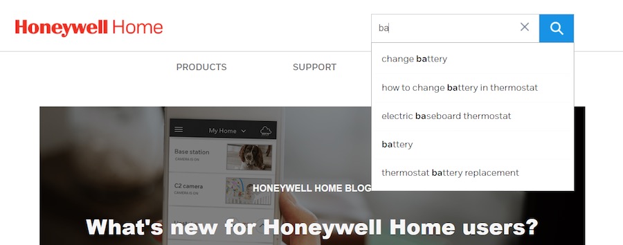
As an industry authority, Honeywell.com uses predictive search modeling for internal search engine population.
Take-Away: Keep in mind visitors are motivated to convert after having established trust. Giving them the right starting point by echoing the questions running through their minds does two things:
- It tells them that your brand has fielded these queries in the past and thus has experience handling them.
- It tells them that they can find viable solutions right away (instant gratification) without needing to continue their search any further.
Pop-Up Live Chat
Pop-up live chats should be implemented as a means to respond to the visitor’s scrolling behavior.
It is one of the most effective ways to engage with visitors in real-time. Pop-ups are strategically triggered by the user’s on-page behavior to indicate a desire to gather information or ask a question about a product or service. Pop-up live chats are responsive to scroll behavior and less likely to interrupt a visitor who is just opening up the page and beginning to take in the information.
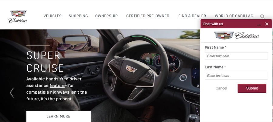
Cadillac.coms “CHAT NOW” pop-up is an opportunity for visitors to launch real-time communication about the content on the page.
Take-Away: Incorporate pop-up triggers based on visitors’ scroll behavior. Use a scroll map to identify where visitors typically pause. That is the area where users may need additional support and implement live chat pop-ups for a conversion-centered webpage.
Before You Leave
When monitoring the user’s behavior there are typical indicators that a visitor is preparing to exit a webpage.
It is customary to use an exit intent pop-up as a last-minute effort to convert.
CCD says that the headline of the exit pop-up must include a promotional offer that is enticing enough to motivate a visitor to follow through with filling out the form. The sign-up form should request essential contact information, such as a first name and email address.
It is important to include any required privacy disclaimers with the sign-up form, but the amount and placement of the text should not detract from the call to action.
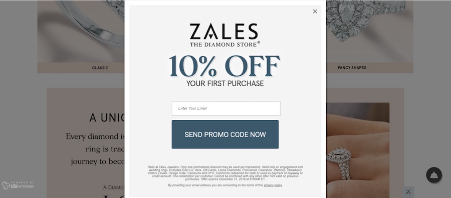
Zales.com provides an additional incentive to visitors as a last-minute attempt to convert a sale.
Take-Away: Be sure that the contact form does not require the user to enter an excessive amount of information. Including a timer that counts down to the expiration of a discount offer creates a sense of urgency for the visitor to complete the form.
Leading with Conversion-Centered Design
Most brands already employ these tactics in some form or the other. This is not a bid to re-acquaint them with what they already know.
Instead it is a reminder that each of these elements can be done right from the get go by following the principles of Conversion Centered Design, and this extra diligence can go a long way in securing more leads and revenue, especially when used in tandem with Conversion Rate Optimization practices.
The end result is simply “more” for your brand. More registrations, more sign-ups and more ROI from CRO drives … at least in the beginning.