How to Incentivize Abandoning Users To Visit Your High-Converting Pages
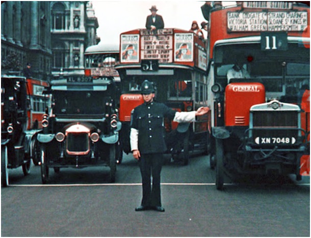
Directing traffic is a tough job. On the streets, it’s a thankless task that comes with rain, mud, and plenty of disrespect from passersby’s. On the web, it can be just as nasty. Talk to any marketer tasked with drawing traffic to a certain page or funnel, and they’ll regale you with stories of failed campaigns and blown ad spend.
Web users are stubborn. They want to go where they want to go. And if that doesn’t align with where you want them to go, there’s a problem. Some people compare it to herding cats, and I would agree. After users absorb your content and interact with your page, you want them to transition towards a high-converting funnel. You want them to browse your offer pages, or check out that awesome promo you’re running. But too often, they never make it.
So how can marketers attract more visitors to high-converting pages? And if possible, can we funnel traffic from low converting to high-converting pages without disrupting the user experience? The tactic I’ll discuss in this post is designed to do just that. It’s called traffic-shaping, and it’s all about turning abandoning visitors into traffic for your high-converting pages.
Using exit overlays as a traffic-shaping tool (examples)
By most measurements, the pool of users who abandon your site without taking your desired action
is between 70 and 95%. This makes them a massive user segment, but since users abandon your page for all different reasons, it’s a mistake to label them as a single group.
[Tweet “Website abandon rates are huge, which provides a massive user segment to target with exit pop-ups”]
So how can marketers glean value from abandoning users?
Traffic-shaping using exit overlays is one tactic that’s generating some impressive results. If you aren’t familiar with exit overlays, they’re modal light boxes that launch by what’s known as exit-intent technology. The technology is designed specifically to recover value from abandoning visitors before they leave your site.
Traffic shaping with this technology is done by placing an exit overlay on pages high-traffic pages with relatively low conversion rates, such as homepages, blog pages, or ‘company’ pages (ex: ‘About,’ ‘Contact’).
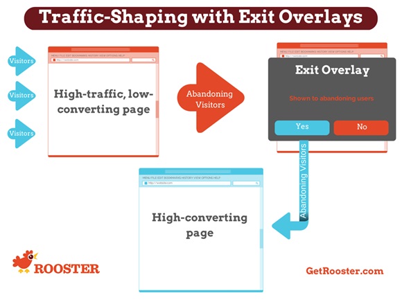
Since exit-intent technology detects the exact moment a user is about to leave your site, the exit overlay activates before users reach the ‘Back’ button.
Once activated, it attempts to re-engage the user and convince them to visit your high-converting page. Here are things to keep in mind about exit overlays:
- Exit overlays are sometimes compared to pop-ups, but they differ for several reasons:
- Exit overlays do not open new windows
- Exit overlays do not inhibit users from leaving your site by blocking or disabling the navigation bar
- Exit overlays are permitted on both Google Adwords and Bing Ads PPC campaigns (pop-ups are not)
And since exit overlays activate only for abandoning users, they don’t interfere with active browsing sessions. Later in the post, I’ll use a case study example to show how you can launch a traffic-shaping campaign on your website, but first, let’s break down why it’s necessary.
Why is traffic-shaping necessary?
There are 4 reasons traffic-shaping can be necessary to increase traffic volume on your high-converting pages.
#1: Most information architecture isn’t conversion-centered
Good information architecture aligns the user’s needs with the site owners’ needs. If these needs happen to align on a high-converting funnel, there’s no problem. But often, websites are structured to help users find information—not drive conversions.
#2: High-converting pages aren’t necessarily high-traffic pages
For web pages that rank in the top 10 on Google, the average content length is 2,000 words. Ever tried to launch a high-converting page with 2,000 words? I certainly hope not. Paid-traffic aside, high-converting pages usually don’t become high-traffic pages by themselves. They usually have limited content and a narrow focus—both things Google’s algorithm doesn’t like.
Blog pages are a great example of this. Blog readers are busy absorbing your content and familiarizing themselves with your brand, but since posts don’t usually have a clear call-to-action, visitors often won’t make the jump to a high-converting page after reading your post.
#3: We often ignore organic visitors that land on our site
Further to my last point, organic visitors are usually drawn in by content—not by high-converting offers. As such, marketers often neglect to optimize the path of these users. And that’s no surprise, since we’re often too busy focusing on the path of our paid visitors.

Search engines aren’t concerned with your conversion rates; they’re only interested in delivering content that satisfies a search query. So further to my point from reason #2, organic traffic doesn’t usually follow a high-converting path. To change this, you need to build a bridge.
#4: You can’t burden the user with finding the right page
It’s your job to convince users to visit your high-converting pages. That can mean simply showing users these pages with well-designed navigation, or it can mean incentivizing the path to these pages. With these reasons in mind, let’s look at an example of traffic-shaping in action.
America’s Cardroom Uses Traffic-Shaping to Boost Tournament Signups
America’s Cardroom (ACR) is a popular online betting portal that offers, picks, lines and tournaments to players around the world. In August 2014, ACR launched a traffic-shaping campaign to increase traffic (and sign-ups) to the landing page for their upcoming Winning Millions tournament.
Step #1: Find high-traffic pages with relatively low conversion rates
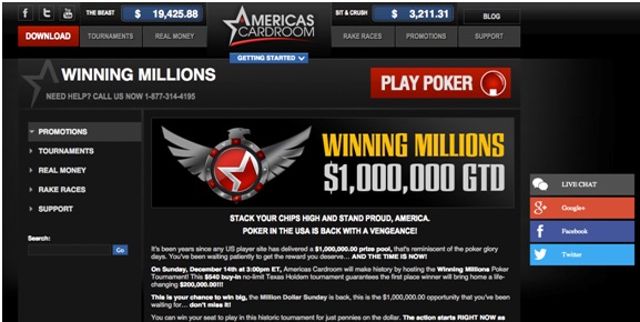
In traffic-shaping, source pages are where you send traffic from. They are high-traffic pages—preferably rich in content—that lack a CTA or logical conversion funnel to turn the audience into customers. Homepages, blog pages, and company pages (e.g. ‘About,’ ‘Contact’) are all typical examples of source pages. ACR’s source page was its homepage:
Like most homepages, ACR must appeal to many different user groups, so establishing a strong conversion funnel for tournament signups was difficult. If you look at the navigation at the top of page, you’ll notice a link for “Tournaments,” but it’s buried amongst many other elements.
Most homepages run into this issue. It’s near-impossible to develop a strong conversion funnel when appealing to so many user groups at once. To find your exit/abandonment rates, log in to Google Analytics and run an “exit rate” report—while bearing in mind the difference between exit rates and bounce rates.
Step #2: Identify your target page(s)
The next step is finding a page to send your traffic; we call these target pages. Relevancy is critical here. If your source page doesn’t discuss what you’re promoting on your target page, you’re unlikely to see an increased conversion rate.
You likely already have a target page in mind. Do you have a high-powered funnel generating strong conversion rates? A promo that’s getting results? Both would be strong candidates. For ACR, the target was (obviously) the landing page for their Winning Millions tournament.
ACR has no trouble maintaining relevancy in this example, since all roads lead back to online betting. Other etailers may find this to be more of a challenge. If you sell shoes online, for example, your high-converting children’s shoes offer won’t be relevant to all customers.
Step #3: Craft your pitch, and design your exit overlay
The messaging on an exit overlay must convey relevant value to the customer, and close with a compelling call-to-action. There are also some design principles to bear in mind:
- Your message (headline/body copy) and CTA must use contrast to stand out from other graphical elements
- Colour and contrast are important to making your message ‘pop’, especially within your call-to-action button
- Having empty areas in your exit overlay is important to making your CTA stand out. Since the colour isn’t important, we call it blank space
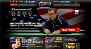
Here’s ACR’s exit overlay for their Winning Millions traffic-shaping campaign:

Exit overlay on AmericasCardroom.eu, activated when users begin to abandon the page
The overlay provides all relevant information related to the tournament, then adds a measure of exclusivity to the offer with the CTA “Qualify for Free.”
Step #4: Target your campaign to specific users

Exit-intent technology platforms allow you to target specific users by adding campaign rules. You can isolate segments such as first-time vs. returning visitors, organic visitors, social media traffic, and shopping cart abandoners. ACR targeted first-time visitors to the homepage who were about to abandon the page, as seen in the screenshot to the right.
The user targeting strategy you choose all depends on your campaign goals, and how aggressive you want to be with your messaging.
To date, ACR’s traffic shaping campaign has:
- Directed 3.44% of abandoning visitors from the ACR homepage to new traffic for the Winning Millions landing page
- Drove a 7.35% increase in signups for the Winning Millions tournament
Have you used an exit overlay to move traffic between pathways on your website?
