Avoid Sliders On Your Website If You Want to Increase Your Conversions

This is Part 2 of the Ultimate Conversion Webpage Review webinar series by Convert and Creative Thirst where we reviewed several websites to examine where many site owners go wrong and provide feedback for improvement.
In the first part, we looked at a popular shoe brand, Chinese Laundry.
This second part is a carry-over of the webinar. It focuses on evaluating an e-commerce site submitted for review called Danish Jewellry.
This site uses one of the most controversial user interface units of a website – image sliders. Some people swear by them, others hate them with a passion.
Today, people still use sliders. However, the same debate exists.
This article will go over:
- Issues with sliders,
- Website header best practices,
- Testing sliders and headers,
- Can reduce website performance.
But first, let’s define what sliders are…
What are Sliders
As defined by Liquid Light, Sliders (also known as slideshows, rotating images, carousels, auto-rotators, faders) are:
“An ‘image slider’ generally refers to the changing image space usually found at the top of a website homepage.”
Example of a website with a slider on its homepage:
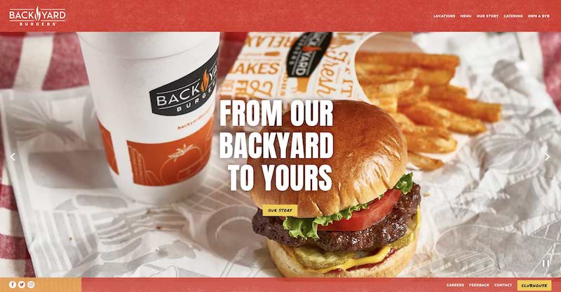
Similar to sticky menus, people in the digital marketing (conversion rate optimizers, designers, developers, UX designers, digital marketers, etc) space have conflicting opinions about the use of sliders.
So who is right? Do rotating images help or harm?
Do You Want Aesthetics or Conversions?
If you want to drive your conversion rate up, steer clear of sliders on your webpages, especially in the hero section of your homepage.
This is a strong claim. Especially considering how many professionals support the use of sliders.
For professionals who disdain slideshows, here are some agreed-upon negatives of using sliders:
- Volatile, often they just don’t work,
- Bad for SEO,
- Decrease fluidity of UX,
- Can increase bounce rates,
- Decrease conversion rates,
- Often they don’t meet website accessibility requirements for disabled people.
Despite the list above, carousels still have some attractive benefits:
- Ability to put layers of information in a compact space,
- Provide image-based information to visitors.
- Allows ecommerce brands to highlight specific products
Despite the brief list of carousel benefits, CROs cannot ignore the fact that auto-rotating images hurt conversion.
Why do sliders hurt conversions?
They deny the visitor time to connect to your site and absorb what the page is all about.
Every visitor to your site is looking for one thing, “what’s in it for them.” And your site only has seconds to convey this. Sliders impede providing this clarity.
In short, they go too fast, which is a huge negative.
These moving images are distracting and overwhelming. Think about being at an amusement park trying to read the placard on a fast-moving ride. It’s impossible.
Let’s take a practical case. You land on a site that gives you the option to click many links; there are categories that are begging for your attention, not to mention a giant image also screaming for your focus. Distractions are everywhere on the page. It’s a bit too much.
Let’s revisit the website, Danish Jewellry, submitted for the webinar.
There are giant images incorporated under ‘review.’ This is not necessarily an awful idea when displaying categories, but only when they show that one will achieve something upon clicking such images.
To counter such uncertainty, it would probably be wise to test adding buttons that are value proposition-based, for example:
Which leads us to our next point. Test, don’t guess.
Opinion Versus Data
Opinions are rampant around what works and what doesn’t in website design.
Still not convinced sliders are not, that’s a good stance. The best thing is, you don’t have to believe any of these statements. You can prove them for yourself. Experiment and test static images versus carousels on your site. Using an experimentation tool like Convert, you can create A/B Test to see exactly which style performs best.
Conversion optimization demands that you test and experiment to confirm or deny opinions – yours, your team’s, and the ideas that permeate the field.
Usability testing is another way to ‘see through the eyes of your prospects’ and understand where friction points exist on your website. Here, you would look to see how your visitors interact with your sliders. Are they engaged? Do they skip them?
Or, you could take a shortcut and just believe the word of an expert who has tested thousands of sites. In an article on Orbit Media, author Tom Bowen rounds up several experts to weigh in on the subject.
Lee Duddell, founder of WhatUsersDo and UX Director says
“They are next to useless for users and often ‘skipped’ because they look like advertisements. Hence, they are an excellent technique for getting useless information on a homepage… Use them to put content that users will ignore on your homepage. Or, if you prefer, don’t use them. Ever.”
Set Clear Expectations for your Website Visitors
Let visitors know what they can expect. Be it text, categories or images/banners and what-not, portraying a coherent message is paramount. Don’t let them wander about trying to figure it out for themselves.
Aim at providing your visitors with clear expectations, instead of disjointed ones. According to this article by Wordstream:
“A landing page should offer all the necessary information, but not so much as to overwhelm (and as a result, drive away) the visitor. Provide the essential info that will interest your audience and nothing more”
If we take another look at Danish Jewellry, another thing they could test is revealing the prices on the products versus making a provision such as ‘Click to see price’.
Why? Because the images used are small and a visitor really misses a lot of details.
The secret behind intelligently withholding information (in this case the price) is to create some allure to the entire experience. With mystery, you’ll get the potential clients clicking through more, which will increase the engagement level on some part of the page.
You should aim for this kind of engagement throughout the sale on the site, though this can be tricky.
Notice the word ‘intelligent’ used above — the purpose is not to drive visitors through a maze that leads nowhere. If you do this, you’ll have them fleeing in droves! AKA, conversions will go down.
Tips for Using Sliders on your Website
If this article hasn’t discouraged you from using sliders and you are still hellbent on putting them on your site, use the following tips to optimize their performance:
- Allow users to navigate the sliders with navigation options. This is integral to user experience.
- Make scrolling controls obvious. Please don’t make your visitors guess.
- Reduce the speed of cycling.
- Ensure it works across different devices.
- As mentioned above, make sure sliders are accessible.

Similar to the first, we could also accuse it of “screaming at the visitors through images on the header section and begging for attention.”
But the images have little value proposition, leaving the visitor wondering why they should click.
Here are a few tips you can Apply to your landing page:
- Have a clear call to action.
- Make it about the visitor.
- Ensure it is easy to scan at a quick glance.
- Make sure it includes relevant quality images.
General statements informing visitors of the services offered are not enough.
Likewise, including other banners (service or website) or social media images and icons do not give the visitor a compelling reason they should click them. What are they going to get when they do? You want to start a relationship with the visitor.
You can check out the demo on the webinar here.
Final Thoughts
Every component of your website plays a piece in your conversation rate. The better your UX and design, the more that rate increases. When people land on your homepage they will immediately form a first impression. So make sure you don’t ruin this first encounter with clumsy, busy, unfocused sliders. If you are going to use them, make sure data-driven testing confirms them winning a spot on your website.


This post was updated by Nyaima Smith-Taylor in July 2020

