The Realist’s Guide to Using Color Psychology in Marketing
Do you know what’s the one thing Facebook, Twitter, and LinkedIn have in common? Yes, they’re all social media platforms … and they’re all ‘blue.’
In fact, most of the websites on the internet are blue. And they’re blue because the right shades of blue are supposed to inspire emotions like trust, confidence, stability, and sincerity in the viewers.
Colors do have a psychological impact on your prospects and audiences. In fact, some studies show that when your online visitors see your website, about 90% of their judgments about your brand are based on your company or brand (or website) colors.
From invoking the right emotions in your target audience to making sure your audiences look at you as a brand they can connect with, colors play a big role in marketing.
But just as testing button colors because the experts in 2005 believed it was the gateway to big conversion improvements is passe, believing color psychology can paint over weak value propositions and poor UX choices isn’t a good approach either.
Yes, colors impact your audiences. But you must know when changing the color of your site elements will work and how in the practical sense color psychology is a great starting point for your brand’s palette.
This blog does just that.
Color Psychology in Marketing Starts with Knowing Your Target Audience
As with any other marketing campaign, choosing the right brand colors needs you to understand your target audience well. If your potential customers are 70% men (or women for that matter), your brand colors should be different.
Pinterest, for example, is a social network where women make the most of the active users, and so they use the color red.
Once you know ‘who’ you’re targeting, research for their favorite colors. There’s a lot of data around this such as the 2003 study by Joe Hallock that showed that blue is the most popular color with both men and women, and green and red are in the top four preferred colors for both genders. The same study showed that purple was the second most popular color among women, but zero men listed it as their favorite and 22% of men listed it as their least favorite color.
If you’re marketing products specifically for men, veer away from purple. But if your audience is mostly women, there’s no need to make everything pink.
Dig into your users’ age group as well.
Interestingly, a person’s age influences their color preferences. A survey of studies on color preference by age found that both children and senior citizens preferred lighter colors, while teens and adults liked darker, richer hues.
However, participants’ fondness for yellow did fade with age, and children from 2-10 years liked the brightest colors overall.
In addition to your potential customers’ gender and age, also look at their income potential as that’s one more factor to consider when choosing the right colors. Colors that signal luxury and sophistication will likely appeal to a wealthier clientele, while bright colors — often associated with low-cost brands — will draw in bargain shoppers. So if you know that a low price is your strongest selling point, you can use a bright color like orange to signal that your products are cheaper than the competition, thereby making your brand feel more in reach to your target customers.
Your audience’s cultural associations with colors is also an important factor to keep in mind.
White, for instance, is associated with weddings in Western culture, but in some Eastern cultures, it’s the traditional color of mourning. So be careful not to turn off your customers with colors they’d rather stay away from. Depending on your audience — and how local or global it is — choose colors that work for the majority. And there are always some safe colors, no matter the cultural orientation or diversity of your audience.
PRO TIP: How to Implement Color Psychology in Your Business?
First and foremost, not everyone will react joyfully to orange. And grey is not a dull hue for all the visitors who come to your site.
Color psychology is NOT an exact science. So to even out the anomalies, you can at best borrow from what studies point to.
1. Identify your largest visitor/customer segment. Largest is key here.
2. Who are they? Age? Income? Cultural background? Expectation from your solution? I would say expectation from your solution is a very important consideration. Are your prospects seeking business maturity by using your tool? Or are they looking to sport a lithe frame and healthy body?
3. Based on what you find in Step #2, find the colors that best represent the sentiment for people from a particular culture and in a given age bracket.
4. This is the starting point for your color palette.
Improve Your Brand’s Accessibility and Conversions
If your target audience is older — for example, if you sell old-age healthcare plans — thinking about accessibility when choosing colors for your website or marketing campaigns becomes even more important.
For instance, a gray-on-white design may look chic to younger eyes, but older users with fading eyesight may struggle to read.
Use an assessment tool to determine whether the colors you’re using — and how you’re pairing them — provide enough contrast to make your information accessible to someone with a visual impairment, young or old.
Accessibility further drills down to the more granular parts of your website’s design — for example, the buttons on your landing pages.
Eye-catchy and bright-colored buttons are easier to spot and thus don’t lose you clicks and conversions because of visibility issues. This means you need to think about your color choices from a conversion standpoint as well.
Provoke an Emotional Response (and Create a Distinctive Brand Identity)
Choosing colors — especially as it relates to branding — is really all about evoking the right emotions in the target audience.
By studying color psychology, you can learn about the traits that are typically associated with the different colors. Your website/branding designer would probably know them already. In general, a brand color palette that aligns with its users’ expectations is received much better by its target audience.
For example, in its rebranding campaign, Airbnb rebranded its logo to use a different color. This allowed Airbnb to better connect emotionally with its audience.
This excellent article explains how Airbnb and Booking.com — two very similar and competing services — use the colors that they use to boost their brand identity:
Take Airbnb and Booking.com. They’re similar companies, but with branding colours at opposite ends of the spectrum. Swap them around and Airbnb starts to look like some Silicon Valley startup, while Booking.com’s web address name is at odds with the warm Rausch pink of its competitor.

Most colors are associated with moods that they evoke across demographics, so you can predict how the colors you choose will make customers feel. Red, for instance, is commonly associated with passion and urgency, while blue is calming and trustworthy.
So map out the emotions you want your brand to invoke, then pick the colors that naturally bring them out. Here’s a quick resource to get you started.
Bringing it All Together
How you use colors together in a color scheme is more important than your choice of individual colors.
Complementary color schemes, which use colors across from each other on the color wheel, are bold and attention-getting, but potentially agitating. On the other hand, analogous color schemes, which use colors next to each other on the color wheel, create a more serene effect. In most color schemes, it’s best to let one color dominate and use other colors to support or act as an accent, creating vital contrast.
The Isolation Effect demonstrates that objects that stand out are more likely to be remembered, and tests have shown that contrast has a more powerful effect than color in increasing clicks. Use enough contrast to guide users through your website, but not so much that they don’t know where to click.
Sometimes, You Just Need to Make a Splash!
Sometimes, you can forget your brand colors, and color your marketing campaigns with the colors around the latest happenings that excite your users.
For instance, when India decriminalized gay relationships, many brands used rainbow colors to show their support.
Tweets, too, got colorful:
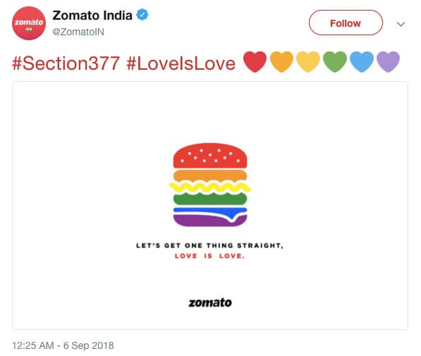
You too can use colors to connect with your audience in these ways.
Wrapping it Up…
Remember that color psychology sounds trendy and fashionable, but it can at best set the mood for your buyers.
Red in a sea of blue can definitely help your CTA button stand out but won’t push your audience to buy, unless the offer is compelling and the checkout process is simple.
An easy to use tool like Convert Experiences helps you test and optimize all aspects of your website, from the low hanging fruits of possible color changes to the more complex considerations of your site processes.